Aurora Cannabis Refresh
In 2023, I had the opportunity to work with Aurora Cannabis to design graphics illustrating their brand purpose and values statements. Since then, Aurora had developed a corporate brand refresh and updated their visual language. As part of the launch of that refresh, they reached out to me again to create a new set of graphics to support the brand values.

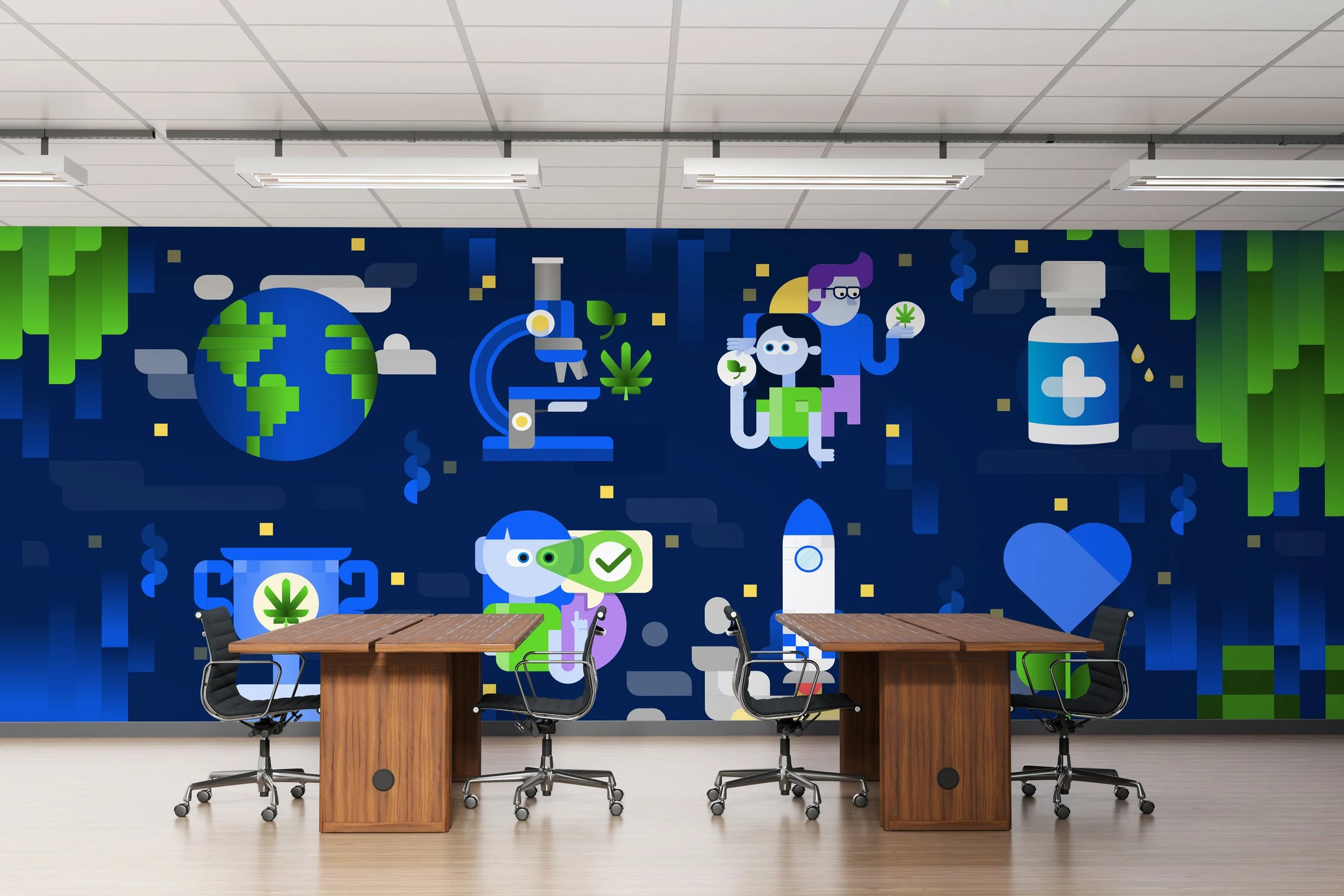
As part of their internal refresh, the Aurora team had created a new Borealis graphic to serve as a cornerstone to the visual language for the new direction. The updated colors, gradients and modern square and beveled corner elements would all inform the direction I would take with the illustrations.
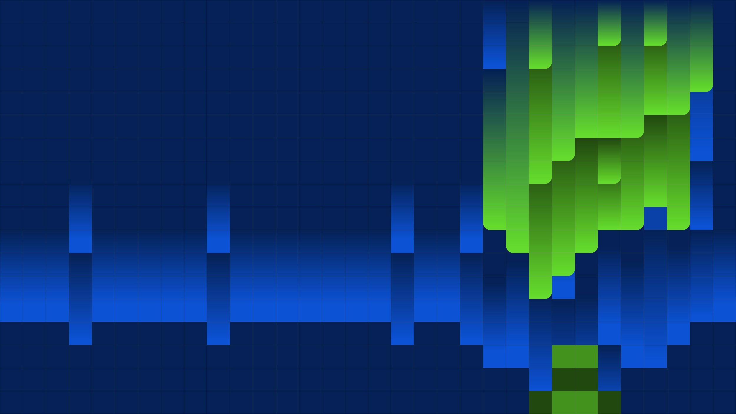
The Borealis graphic was constructed on a strong square grid system. This would serve as the foundation for the new illustrations. Designed on the same grid, the new elements would fit within the established style and become seamless extensions of the established visual system.


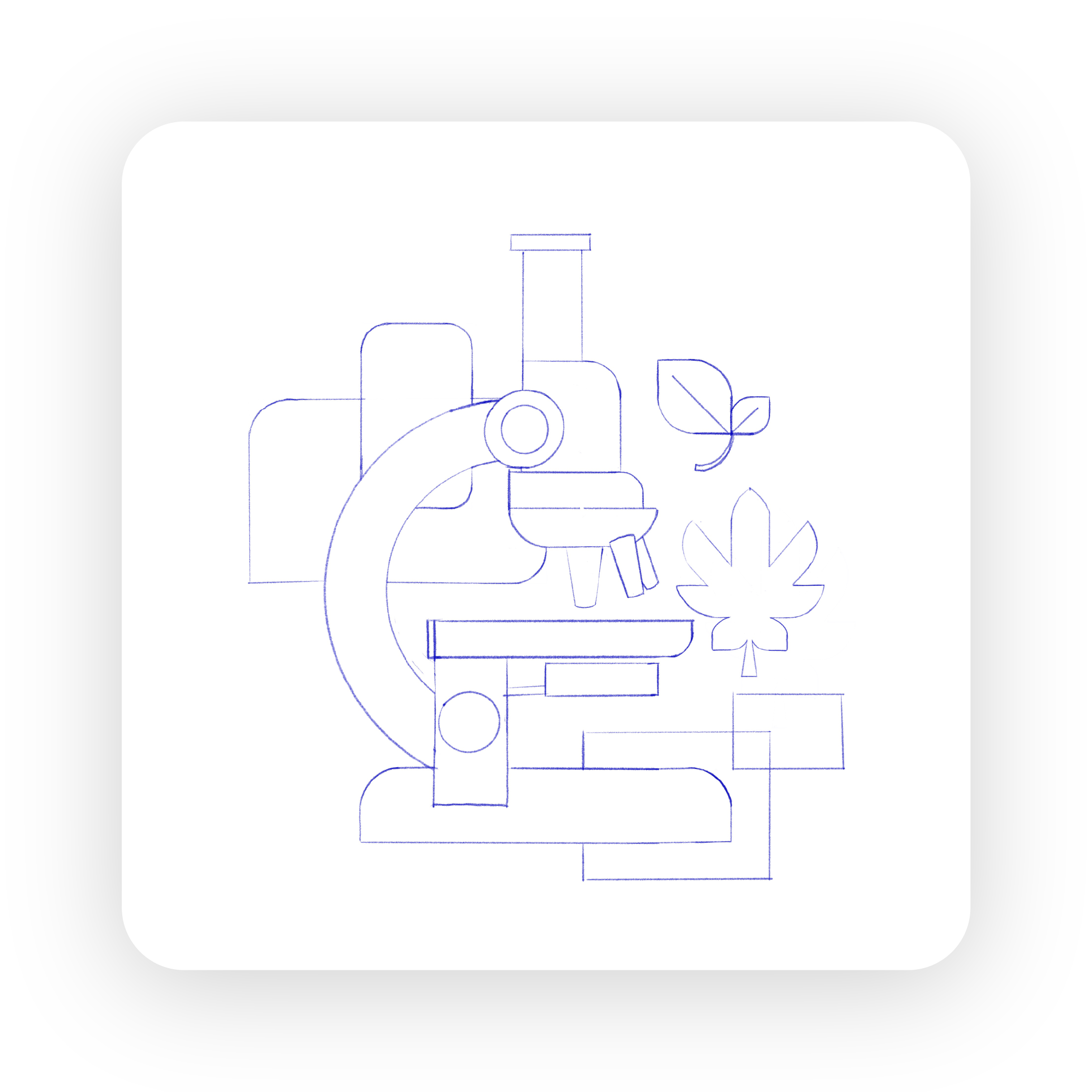
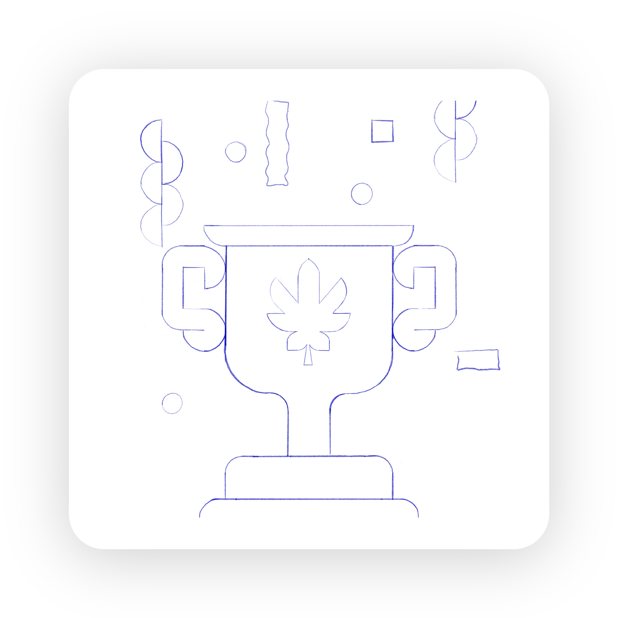


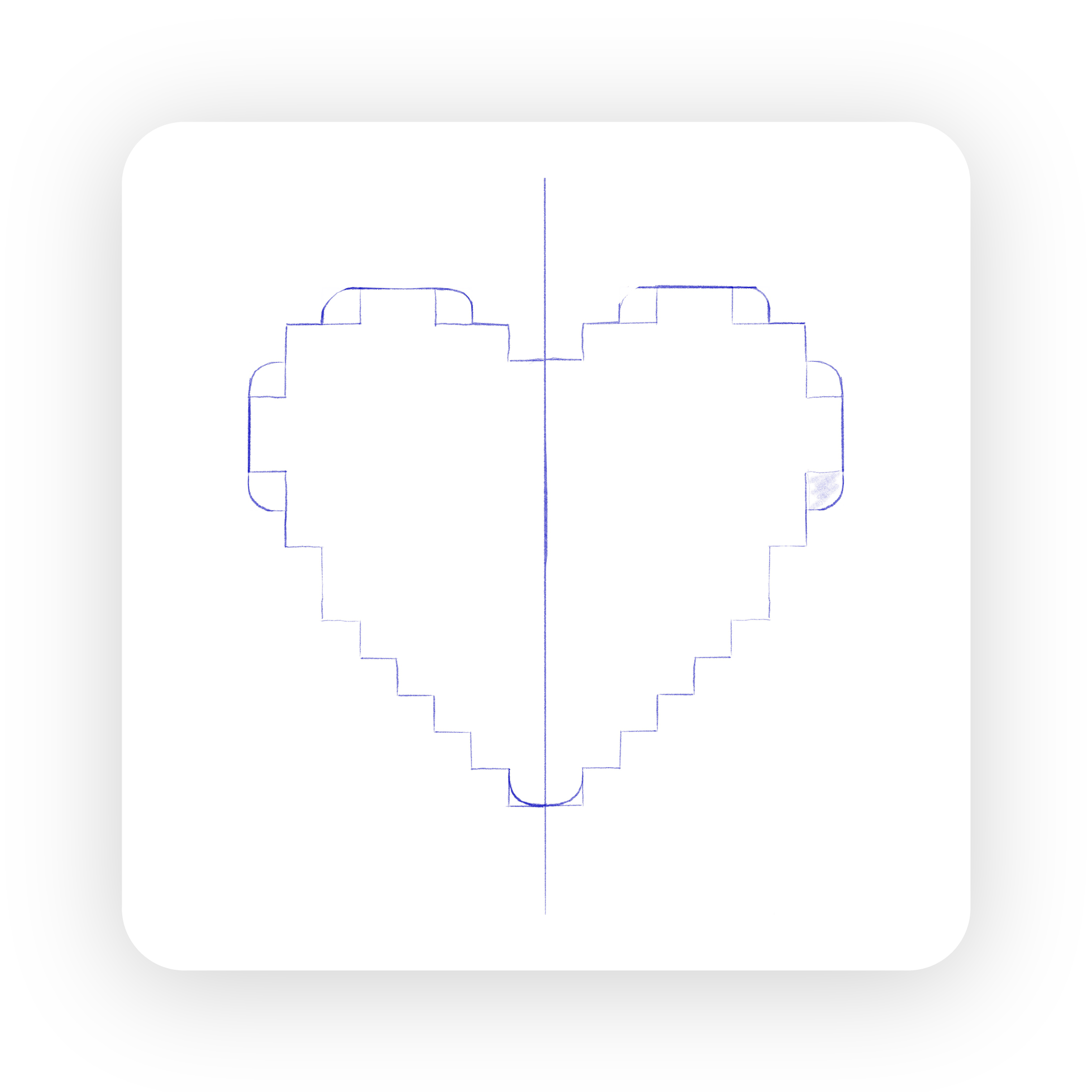
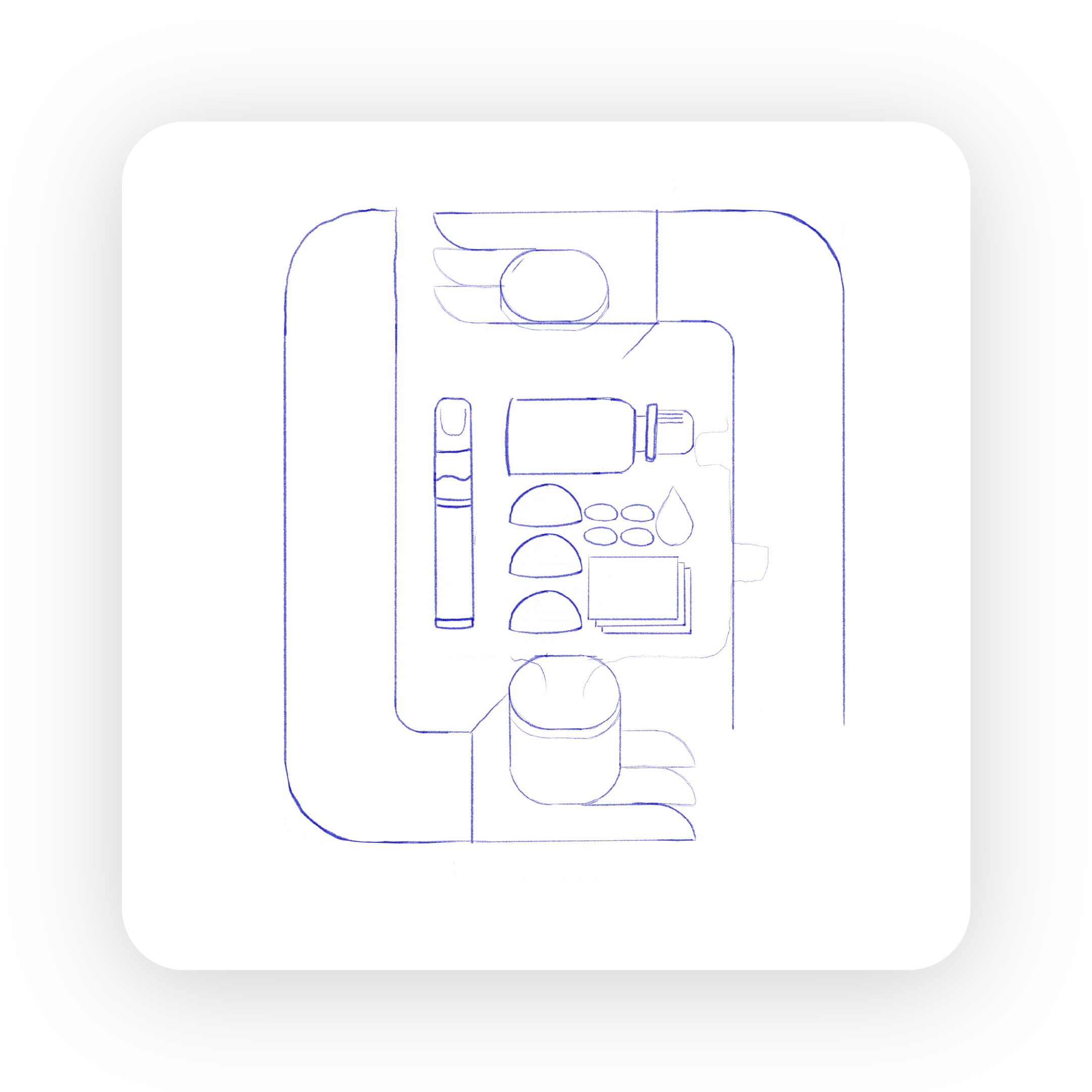

Sketches of the initial icon designs following the square grid. Some concepts underwent revisions through collaboration with the Aurora Cannabis team while others remained untouched in the final design.
Purpose


Opening the World to Cannabis™.
Enabled by Science. Empowered by People. For Patients & Consumers.
Values


Courage
Compassion
Accountability
Winning Together
The graphics were designed in a modular system so they could be displayed separately to highlight individual values or together as one larger incorporated mural graphic.
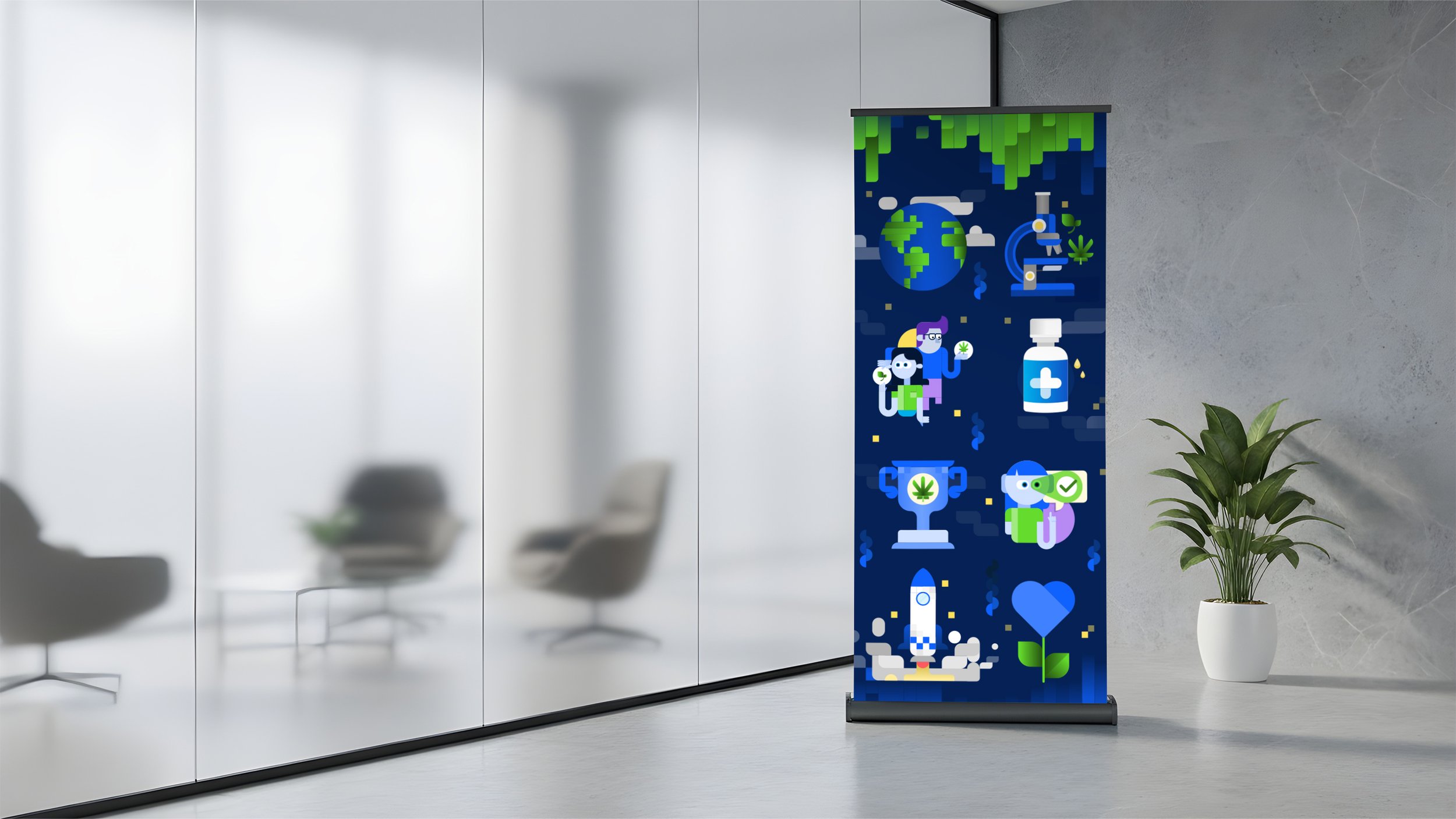

In its final form the graphics represent the brand purpose and values well, and build on the updated brand style. These designs set a foundation for illustration and graphic stlyes within the borealis grid system and can serve as a reference point for the brand moving forward.